在我的另一篇博文JS撸一个时钟,是用css和js写的一个时钟。
贯宇之前也写过一篇使用canvas制作的的钟。
有兴趣可以看看。
那么如何用纯CSS也写一个呢,比如下面这样
这是我在designmodo上看到的demo,并自己重新实现了下。
有兴趣看源码,狠戳这儿
** 主要利用的就是animation-timing-function:steps() **
animation 有八个属性
animation-name
动画名称
animation-duration
动画时间
animation-timing-function
动画的过渡类型
animation-delay
动画延迟执行的时间(负数将截断动画)
animation-iteration-count
动画循环播放的次数
animation-direction
动画循环播放次数大于1次时,动画是否反向运动
animation-play-state
对象动画的状态
animation-fill-mode
对象动画时间之外的状态
** 本文只讲解animation-timing-function 中与steps相关的部分 **
animation-timing-function 的取值有如下几种情况
** ease **
缓解效果,等同于cubic-bezier(0.25,0.1,0.25,1.0)函数,既立方贝塞尔。
** linear **
线性效果,等同于cubic-bezier(0.0,0.0,1.0,1.0)函数。
** ease-in **
渐显效果,等同于cubic-bezier(0.42,0,1.0,1.0)函数。
** ease-out **
渐隐效果,等同于cubic-bezier(0,0,0.58,1.0)函数。
** ease-in-out **
渐显渐隐效果,等同于cubic-bezier(0.42,0,0.58,1.0)函数。
** step-start **
马上转跳到动画结束状态。
** step-end **
保持动画开始状态,直到动画执行时间结束,马上转跳到动画结束状态。
** steps(
第一个参数number为指定的间隔数,即把动画分为n步阶段性展示,第二个参数默认为end,设置最后一步的状态,start为结束时的状态,end为开始时的状态,若设置与animation-fill-mode的效果冲突,而以animation-fill-mode的设置为动画结束的状态。
** cubic-bezier(
特殊的立方贝塞尔曲线效果。
让我们看看规范里是怎么描述的
** ease **
The ease function is equivalent to cubic-bezier(0.25, 0.1, 0.25, 1.0).
** linear **
The linear function is equivalent to cubic-bezier(0.0, 0.0, 1.0, 1.0).
** ease-in **
The ease-in function is equivalent to cubic-bezier(0.42, 0, 1.0, 1.0).
** ease-out **
The ease-out function is equivalent to cubic-bezier(0, 0, 0.58, 1.0).
** ease-in-out **
The ease-in-out function is equivalent to cubic-bezier(0.42, 0, 0.58, 1.0)
** step-start **
The step-start function is equivalent to steps(1, start).
** step-end **
The step-end function is equivalent to steps(1, end).
** steps **
Specifies a stepping function, described above, taking two parameters. The first parameter specifies the number of intervals in the function. It must be a positive integer (greater than 0). The second parameter, which is optional, is either the value ‘start’ or ‘end’, and specifies the point at which the change of values occur within the interval. If the second parameter is omitted, it is given the value ‘end’.
** cubic-bezier **
Specifies a cubic-bezier curve. The four values specify points P1 and P2 of the curve as (x1, y1, x2, y2). Both x values must be in the range [0, 1] or the definition is invalid. The y values can exceed this range.
2.4. The ‘transition-delay’ Property
从规范我们知道
** step-start 等价于 steps(1, start) **
动画分成1步,动画执行时为开始左侧端点的部分为开始
** step-end 等价于 steps(1, end) **
动画分成一步,动画执行时以结尾端点为开始
那steps究竟是什么呢?规范中是这样描述的
Specifies a stepping function, described above, taking two parameters. The first parameter specifies the number of intervals in the function. It must be a positive integer (greater than 0). The second parameter, which is optional, is either the value ‘start’ or ‘end’, and specifies the point at which the change of values occur within the interval. If the second parameter is omitted, it is given the value ‘end’
** 试着翻译下: steps函数定义了一个阶梯(阶跃)函数,有两个参数。第一个参数指定了该函数中的间隔数量。它必须是正数,也就是要大于0。第二个参数是可选的,可以取 start 和 end。指定在每个间隔的起点或是终点发生阶跃变化。默认值是end. **
可能对start,end 比较懵逼。让我们看看下图
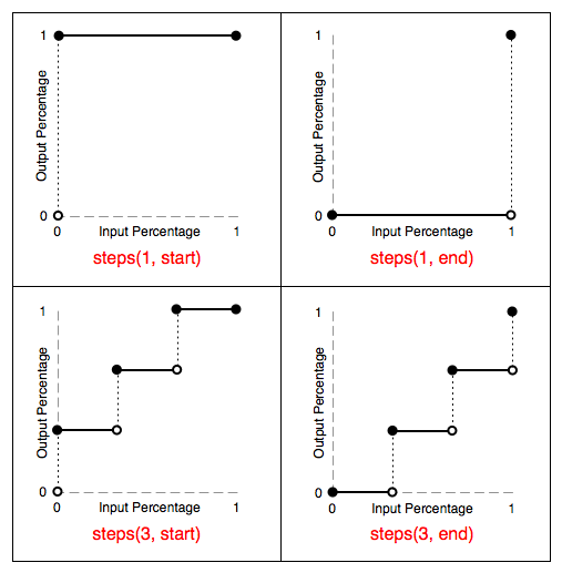
** 通过上图,可以清晰的看到第二个参数为start时,动画在每个间隔的最初就执行了。而为end时,动画在每个间隔的末尾才执行。 **
通过下面这个demo来加深下理解。
有兴趣看源码,狠戳这儿。
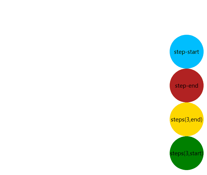
不难观察到
** step-start / steps(1, start) 在动画一开始就走到了终点 **
** step-end / steps(1, end) 在动画末尾才到达终点 **
** steps(3,start) 始终领先 steps(3,end) **
** ease 的消失标志着整个动画的结束 **
到这儿我们对steps()已经有了大致的了解
不得不提的是
** timing-function 作用于每两个关键帧之间,而不是整个动画 **
先看demo
有兴趣看源码,轻戳这儿。
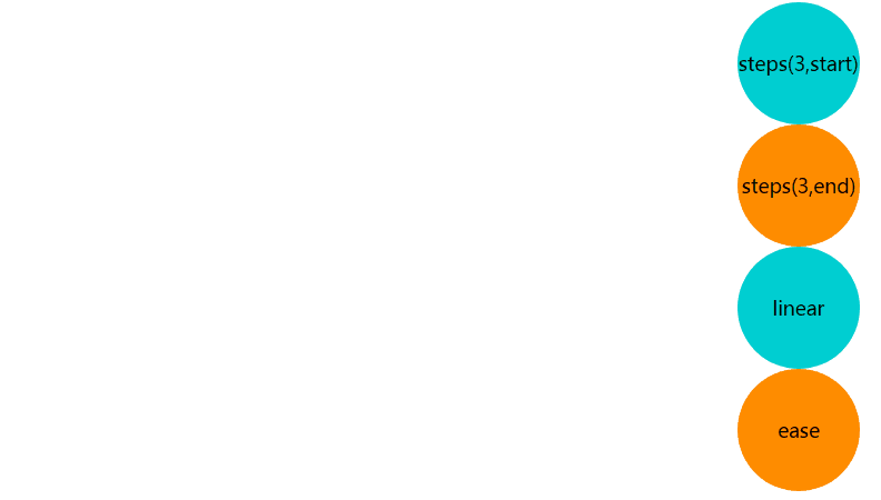
通过代码讲解下
 @keyframes test {

   0%{
     transform: translateX(0px);
   }

   50%{
     transform: translateX(250px);
   }

   100%{
     transform: translateX(600px);
   }
}
上面代码中有3个关键帧,分别是在0%,50%,100%。
若
animation-timing-function:steps(3,start);
或者
animation-timing-function:steps(3,end);
** 也就是0%到50%,50%到100%,每两个关键帧之间各有三处动画跳跃。 **
** timing-function 作用于每两个关键帧之间,而不是整个动画 **
上面的两个demo中的ease和liner过渡,会在每个关键帧之间插入补间动画。
有些效果不需要补间,只需要关键帧之间的跳跃,这时应该使用steps过渡方式。
** 关于实际场景中的应用,举个列子:用来切换雪碧图,实现状态切换。**
曾经写过一篇旋转的立方体,感兴趣可以看看。
** 参考 **
W3C CSS Transitions
css动画里的steps()用法详解
CSS3 timing-function: steps() 详解
深入理解CSS3 Animation 帧动画
动画如何识别关键帧和中间帧?